


Jamman
-
Posts
235 -
Joined
-
Last visited
Content Type
Forums
Articles
FAQs
Online Manual
Support: Blocks
Support: Games
Bug Tracker
SIGames Manual (beta)
Profiles
Posts posted by Jamman
-
-
Just now, HUNT3R said:
Which is a bug.
Even if it stuck its woeful
How is this better than the old layout?
 3
3 -
1 minute ago, HUNT3R said:
As I have mentioned - you can resize the tablet.
I updated my post above.
The tablet is clunky and has to be reactivated all the time as it keeps disappearing during the games etc.
Not as good as widgets by a mile.
2 -
24 minutes ago, HUNT3R said:
This isn't the feedback thread. If you have feedback, please post in the dedicated thread. Thanks.
This is ignoring everything I posted. What exactly are you looking for? There's very little to go on here.
I'm able to watch a match and have info :

This is, again, where proper constructive criticism helps.
PLayer performances
Opposition player ratings and performances
League table
Opposition tactics etc.
How do you get that view as all I get when I press tablet is a horrible massive panel that takes up a third of the screen that doesnt stick and half the information only shows between highlights.
This is a version of what I use, but I often have more widgets loaded.
These are there when I start a game are subtle and unobtrusive, they stay throughout. Can that be done with the tablet view as Im not seeing it.
2 -
- Popular Post
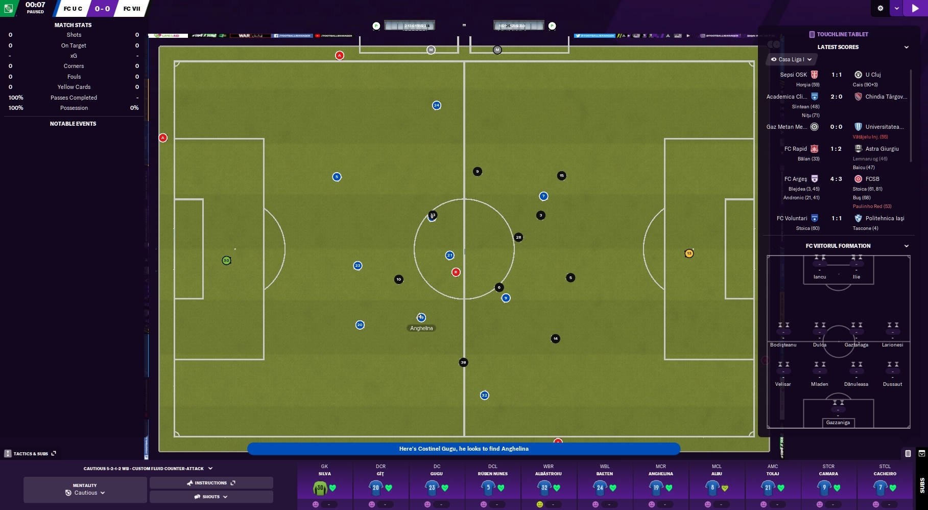
Oh dear, what have you done to the match day UI? Dont want to be overdramatic but its ruined for me.
Feared the worse from screenshots and the odd stream pre-release but after trying demo its as bad as I thought.
It looks nice enough and some of the touches are nice, the team list and the TV like goal graphics, but as a football management game its awful.
When Im watching the game I want more than pretty presentation, I want to see stats and information that give me a quick and easy view of how the game is going, how we are performing and how each player is doing. When there is no information on the screen apart from that bottom bar I cant see anything and to get what I used to be able to see at a glance whilst the game is going on you have to keep popping the stats up. Ive attached the view I normally have in 2020, theres normally a league view too. As you can see I have all the information at a glance whilst watching the game, now I dont see any of it without manually checking.
This for me is a massive step back from previous versions and looks dumbed down.
This is the first version of FM Ive seen since 92 that I havent bought at release and I cant see myself buying it at all.
9 -
Ive bought every version of FM on release date since the Amiga version in 92.
2021 is the first version I havent. Mainly because Im still into my 2020 save, but more importantly from the match UI I have seen.
Have just tried the demo and it confirmed my fears, its terrible.
I normally play with widgets coverering large parts of the screen. At a glance I can see exactly whats going on in the game, how the stats are adding up, who is playing well, and how we are doing in the league. AND I can see the highlights.
Now to do all that I have to keep checking manually.
This is a massive step in the wrong direction and I cant see myself buying this version.
Its a shame as some of the matchday details, ie the team lists at the start and the TV like goal announcements are nice, but that have dumbed down everything else far too much and taken the customisation away.
Very poor.
3 -
Hi,
Where do you set the players squad status now?
This player is one of my stars yet is set to surplus to requirements?
choose files... Click to choose files
 0
0 -
I dont seem to see tactics from the workshop to add after subscribing.
Are they saved to a certain location?
Always worked simply in the past.
0 -
1 minute ago, rdbayly said:
Does anyone know if this was one of the Brexit outcomes from FM19, or has it changed?

Genuine question also - Have SI taken advice / guidance from specialists on what may happen in the world of football post Brexit, or is this just their 'take' on it?
As no one knows what will happen with Brexit as it hasnt happened or been decided what it is no one can make an accurate decision.
0 -
CAn the league table widget be changed to allow it to show 24 places.
I have managed to get it to do it on a couple of occassions, but no idea how, it cant be expanded normally
 0
0 -
Just now, gavinski33 said:
But surely if you're interested enough to pay such close attention to your under x teams that you require a tab, then you'd be interested enough to control some facet of their development? I think some of the grumbling about the handful of new UI features are because they're just a bit different to what we've always had, and we're 24 hours in. Tabs, to me anyways, are pretty much this years purple. But as you said, people have different priorities. I'm slowly figuring my way around it and I'm sure it'll all become second nature again soon enough
Not really, I want to be able to check up on the squads, move people in and out, but I never want to take control of training.
Its not about being second nature, its about good UI, having to click twice and move the mouse to get through a screen you dont want, when one click did the same thing isnt something getting used to new UI features, its about having regularly used screens hidden behind other screens when theres no real benefit.
Ive raised it as a feature anyway.
6 -
You have changed the way you access U23/U18 and added a mouse movement and extra click to get to the U23 squad when it used to be one click.
This screen is one of the most used screens for me and to have to navigate via Dev Centre (which doesnt seem to give me a lot that I care about) is irritating.
Could we either get links put back like they were, or allow access from the Senior squad screen, or optional ability to add the shortcuts back on the task bar.
As you can see screen space is not an issue for some of us!
 1
1 -
Just now, Seb Wassell said:
Feedback noted
")
We believe that the benefits the Development Centre brings (and it needing to be on the sidebar), to both hands-off and hands-on Users, outweigh the added click.
However, if after spending some time with it (changes to a familiar system can take a little while to settle sometimes), you believe this not to be beneficial with the way you play, please do let me know why that is.
I can already tell you qhy on this one and it wont change, I go in and out of the U23 screen all the time, the extra info doesnt give me anything I want to see so its just poor UI for me. Having the option to have all your squads on the sidebar should at the very least be optional.
3 -
3 minutes ago, Seb Wassell said:
Please do post a feature request

Out of interest - what resolution/text size are you using there and is there not a more suitable one? That does not look ideal.
2560 x1440 and no offence its a very suitable one, I have lots of screen estate and in match I can get tons of info on there.
Rather than focussing on people who cant fit much on their screens you should also be considering those of us who have larger monitors who can include more.
Posting a feature request for something that existed in the last game seems a bit of a pain.
3 -
Just now, Seb Wassell said:
It is now two clicks to dip in and out:
'Development Centre > Under X Team - Squad'
or
Right-click on the Dev Centre sidebar icon and select via the tree menuThe intention of the Overview pages (general and team specific) under the Dev Centre is to provide you with more, and more contextual, information than the Squad page provides. We believe this to be more beneficial to Users that prefer a hands-off approach to the Youth teams. The view here is adaptable and will be remembered when you navigate away.
Didnt realise you didnt have to click the title, but even so, its two clicks and having to move mouse when we could just click once.
You are doing a Microsoft here and adding clicks and complexity where not needed.
Going in and out of the U23s is something I Do all the time, having to do this is just a pain, and as you can see from the screen grab I posted, I have less than half the side bar used so its daft.
3 -
Just now, Seb Wassell said:
Unfortunately we cannot have them available by default at this time as they would not fit on the sidebar in minimum resolution.
CAn they be added manually by those of us that have modern monitors.
AS you can see I have a bit of space left
 2
2 -
54 minutes ago, Seb Wassell said:
This is now contained within the Dev Centre.
If you would like the sidebar icons present, you need to take control of that team (team training, individual training, matches or the whole thing).
Very poor UI on that one.
To get to the U23 now requires three clicks rather than one simple click, and having to take control of the team just to dip in and out is not a solution.
2


Match screen layout like FM2020 and earlier versions...
in Football Manager General Discussion
Posted · Edited by Jamman
Theres nothing that tablet does that widgets didnt do better. ITs a massive step backward and ruins the entire match day experience.
Football managers experience a 90 minute game, they know whats going on as they watch the whole thing. We dont, we have to rely on stats, they need to be available on screen and presented nicely, not like this.
Sorry but this is a terrible implementation and for me they have ruined the game. Ive been playing since 92 and its the first time in nearly 30 years Ive been so disappointed withit Iwont be buying it. (and thats without going through the clunkiness of the rest of the game and how it looks more like one of those imitations Soccer Manager! game, but I wont go there).